C:\ARCHIVE\T_004_THRIFTUP\case_study.txt
ThriftUp
Making second-hand fashion feel first-rate.
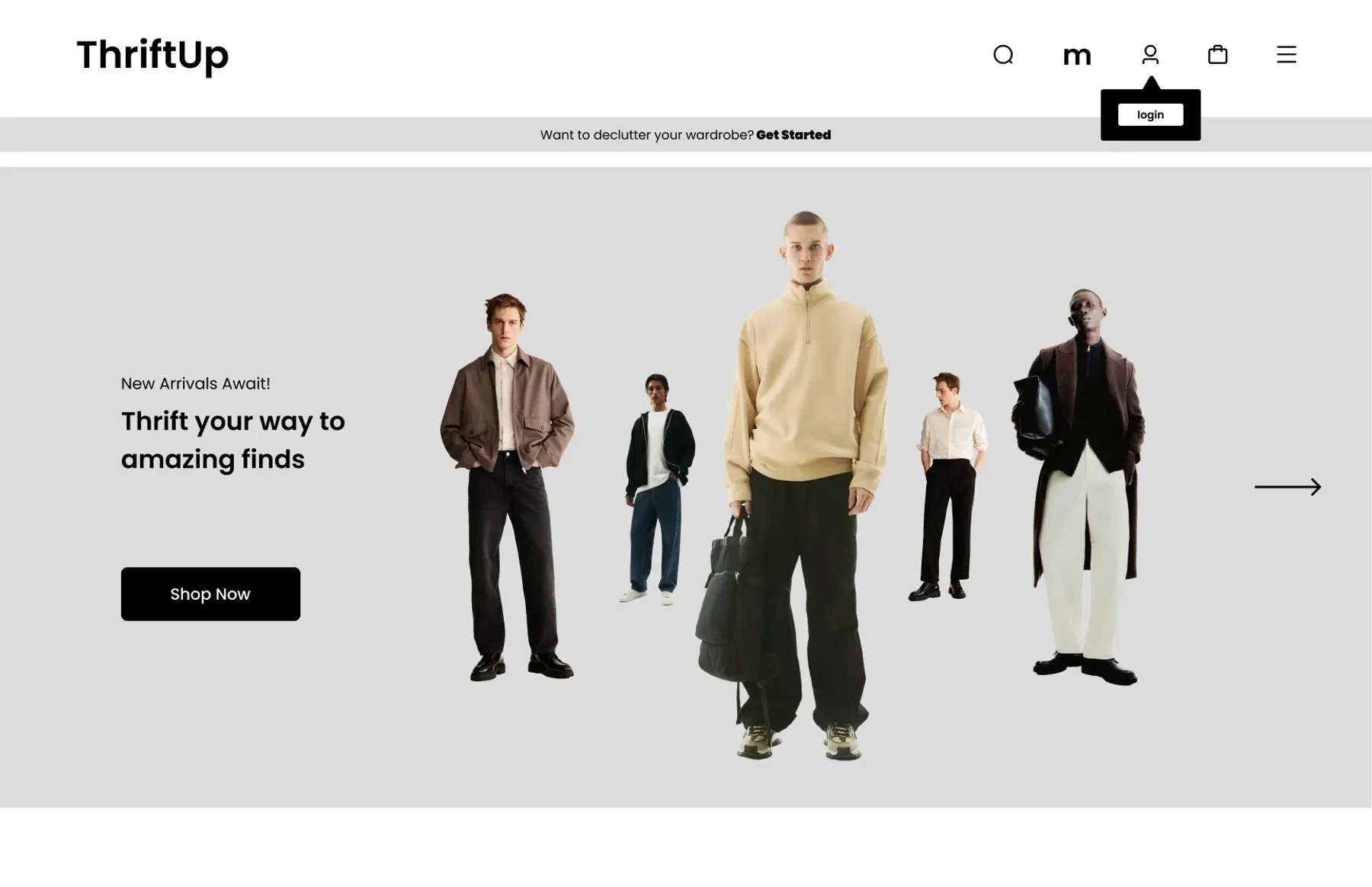
An online thrift store for young adults, with ModaCash: a buy-back program that turns clothes you no longer wear into cash.
01Overview
Second-hand should fix price and planet. People just don’t trust it.
New clothes are expensive and fast fashion is bad for the planet. Second-hand clothing should fix both, but physical thrift stores take time to dig through, and buying second-hand online means guessing about quality from one blurry photo.
ThriftUp is my answer: a curated online thrift store for budget-conscious, eco-minded young adults, paired with ModaCash, which lets shoppers send in old clothes and get paid when they sell. It gives people a reason to recycle, and keeps the store stocked.
02The problem
Three barriers kept young adults away.
New fashion is expensive.
Especially for students and early-career professionals.
They care, and still buy fast fashion.
Sustainability loses to convenience.
Second-hand online feels risky.
No way to check condition, fit or authenticity before you buy.
Make shopping second-hand online feel as reliable and convenient as buying new, and give people a reason to sell back what they no longer wear?
03Who it’s for
Two budgets, one doubt: is this actually any good?
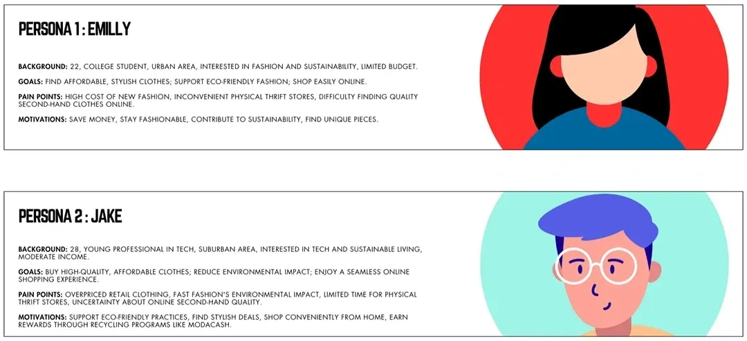
Emily and Jake have different budgets and lifestyles but the same question. Price got them interested; trust would decide whether they bought. So trust became the main thing the design had to deliver, and price came second.
04Process
Sketches, wireframes, final. The structure never moved.
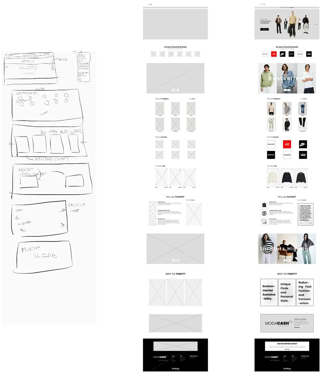
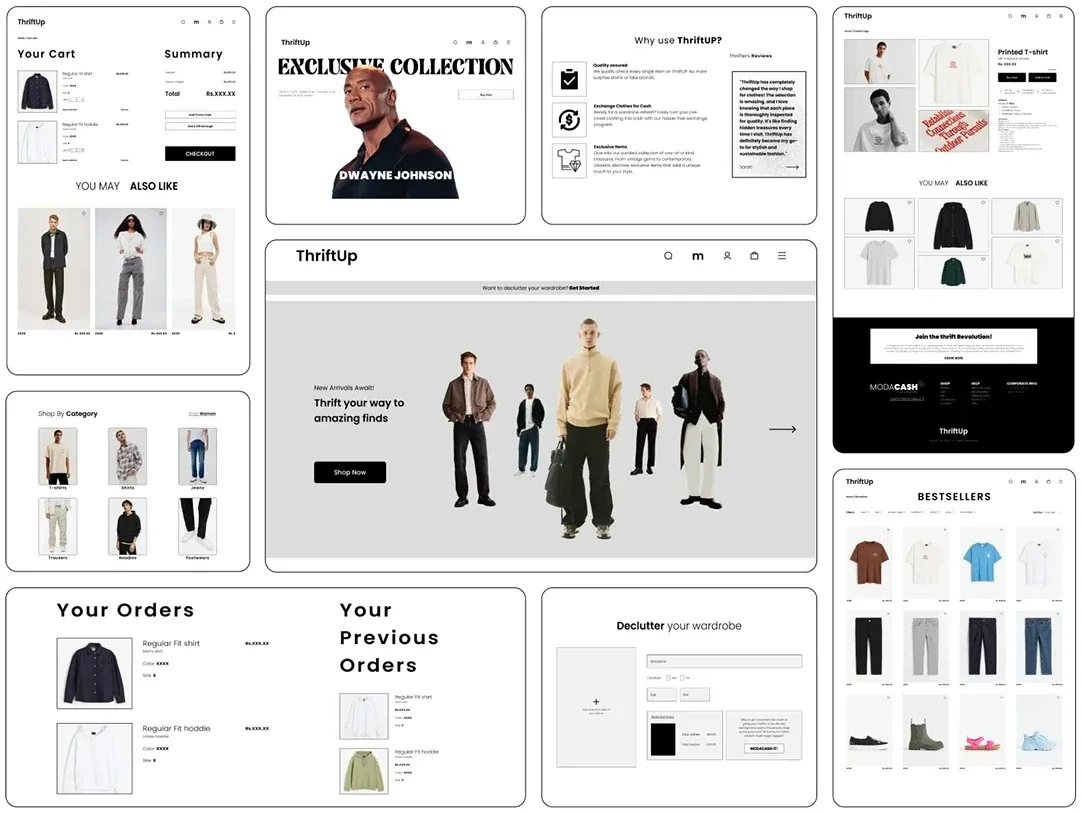
I kept the homepage structure stable at every stage, so each round improved content and visuals instead of reworking layout. The page tells a story top to bottom: hero, familiar brands, ways to start browsing, why ThriftUp, community, why thrift, the ModaCash invitation, and the newsletter.

05Information architecture
Five things in the header. Login only at checkout.
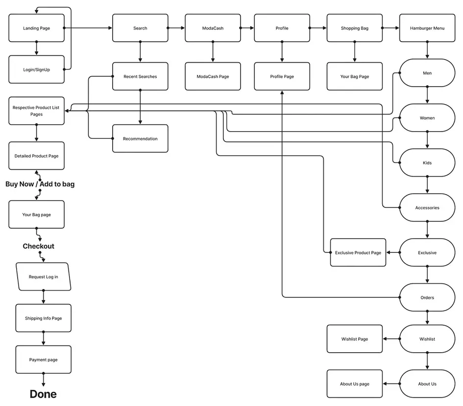
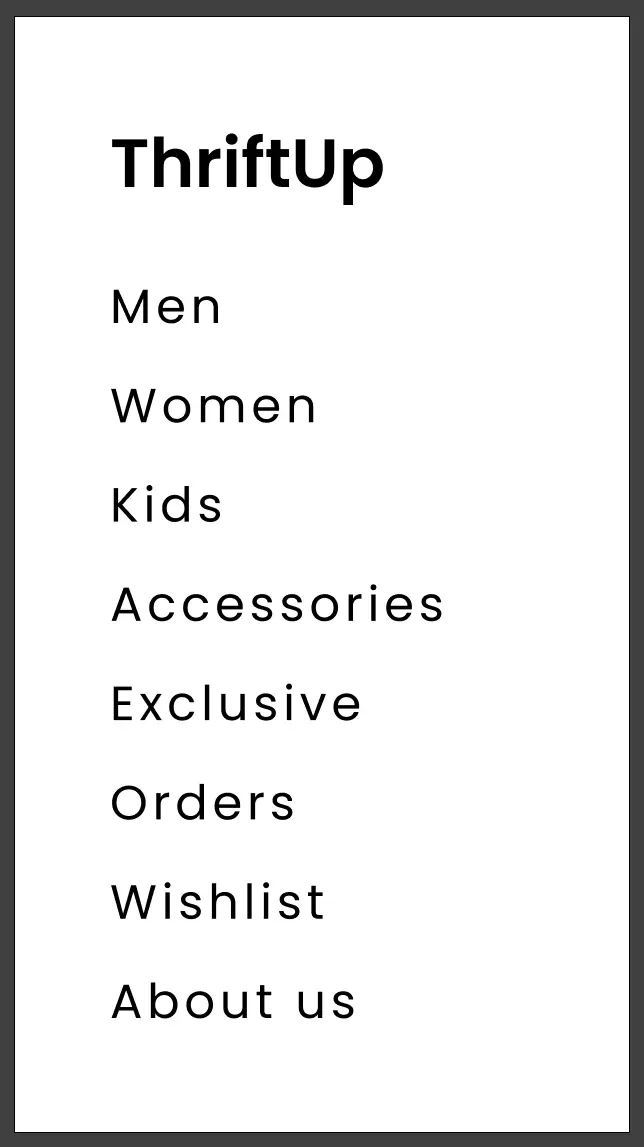
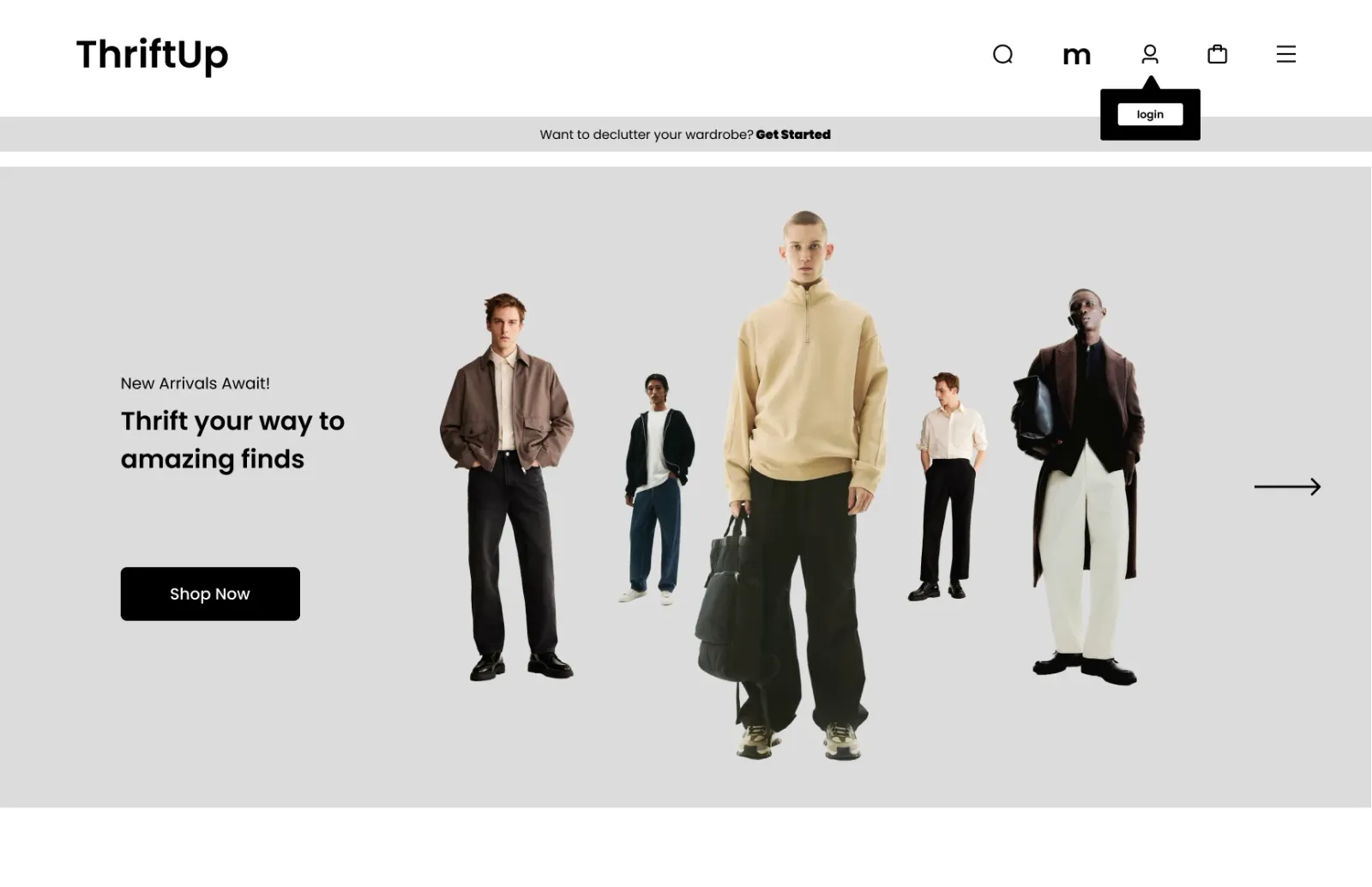
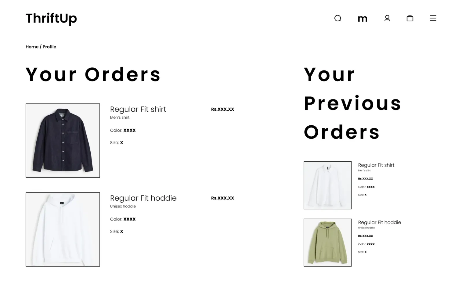
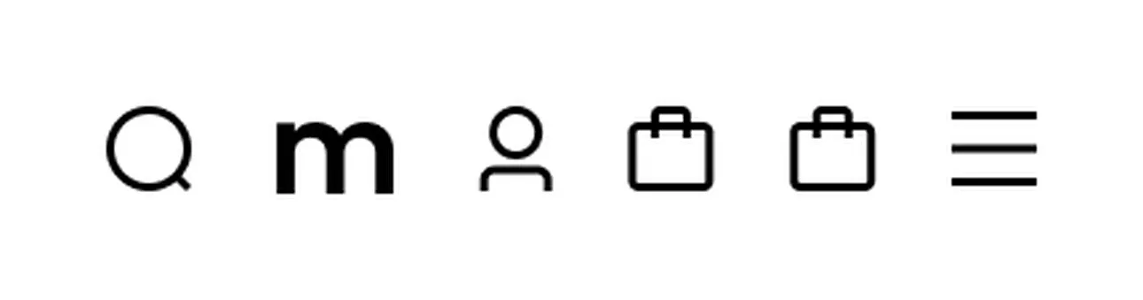
The header holds Search, ModaCash, Profile, Bag and a menu. The purchase path is short and linear: list → product → bag → checkout → log in → shipping → payment → done.
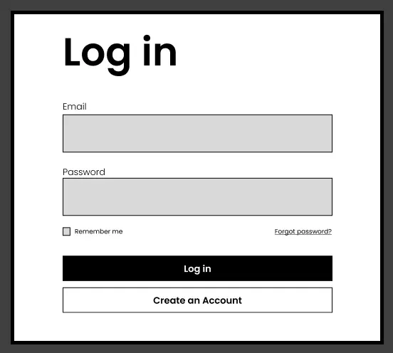
Anyone can browse, search, wishlist and fill a bag without an account. A lightweight log-in pop-up appears only when it’s actually needed, not as a barrier at the door.
06Key decisions
Five decisions that carry the design.
1 · Selling is as easy to find as buying
ModaCash has its own icon in the main header, and an announcement bar on every page asks, “Want to declutter your wardrobe? Get started.” Shoppers are sellers too.
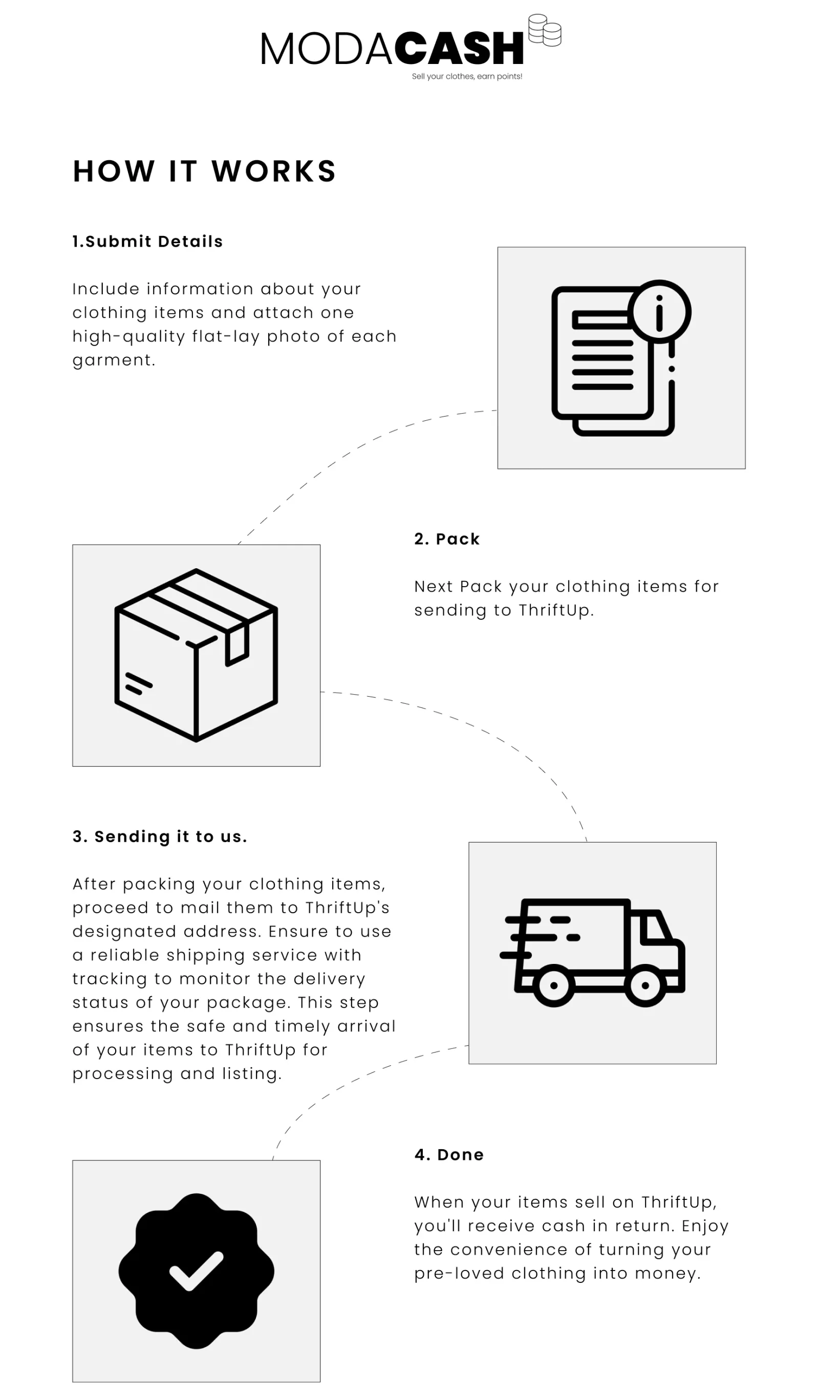
2 · ModaCash in four plain steps
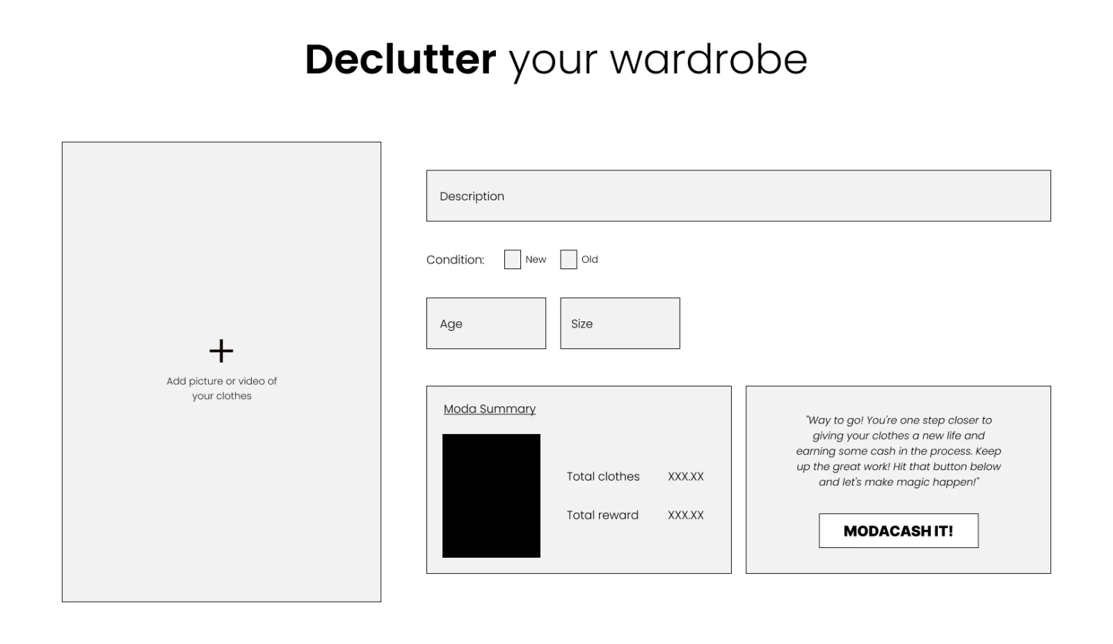
Submit details, pack, send it to us, get paid when it sells. The declutter form is a single screen with one ModaCash it! button: lighter than taking a bag to a donation bin.
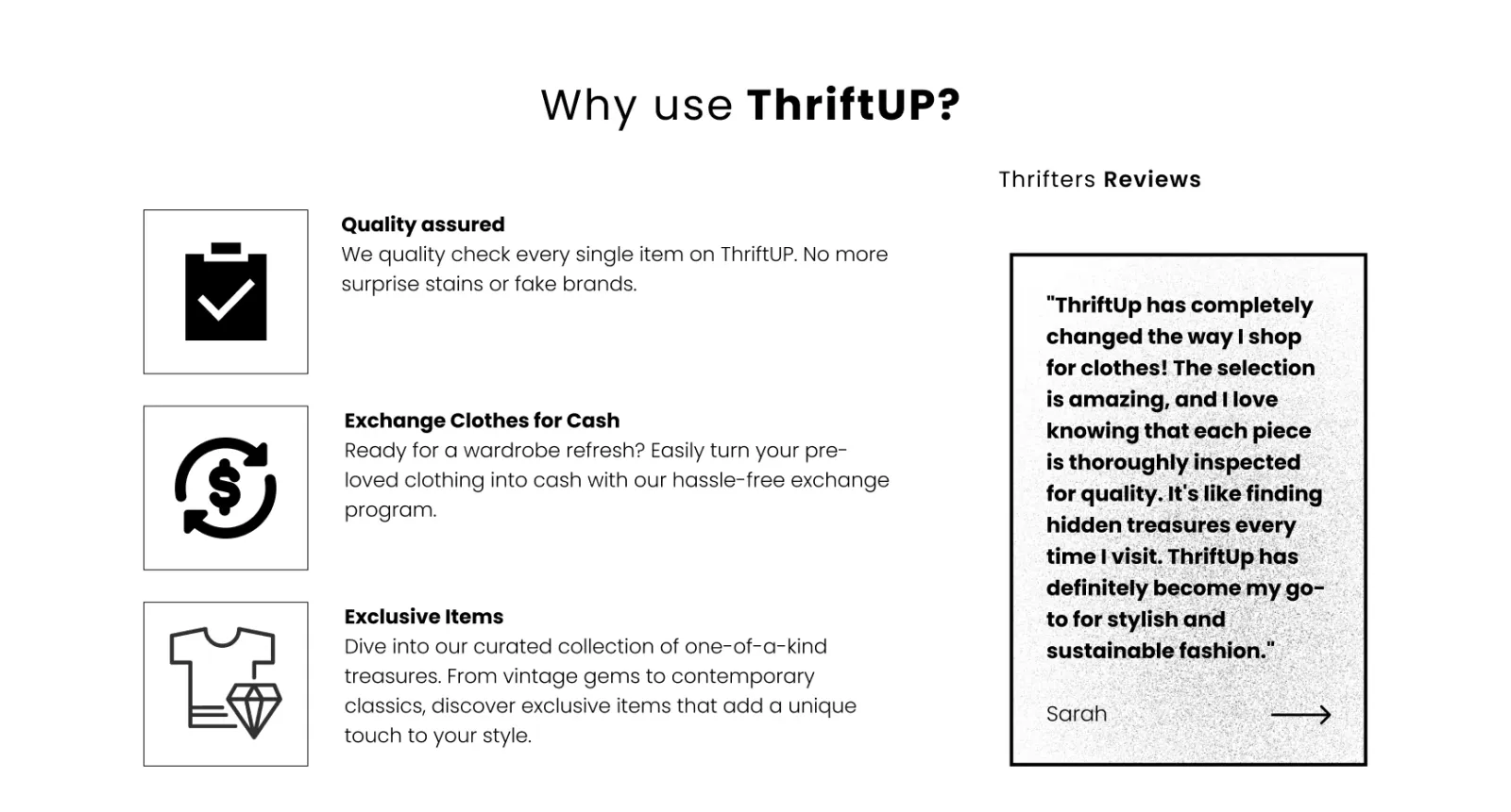
3 · Every trust worry has an answer in the UI
- “Is it in good condition?” Every item is quality-checked, and the brand strip says so.
- “What does it really look like?” Several high-resolution photos, including close-ups.
- “Do other people like it?” Thrifter reviews sit on the homepage.
- “Is this a real store?” Familiar brands up front, retail-grade polish.
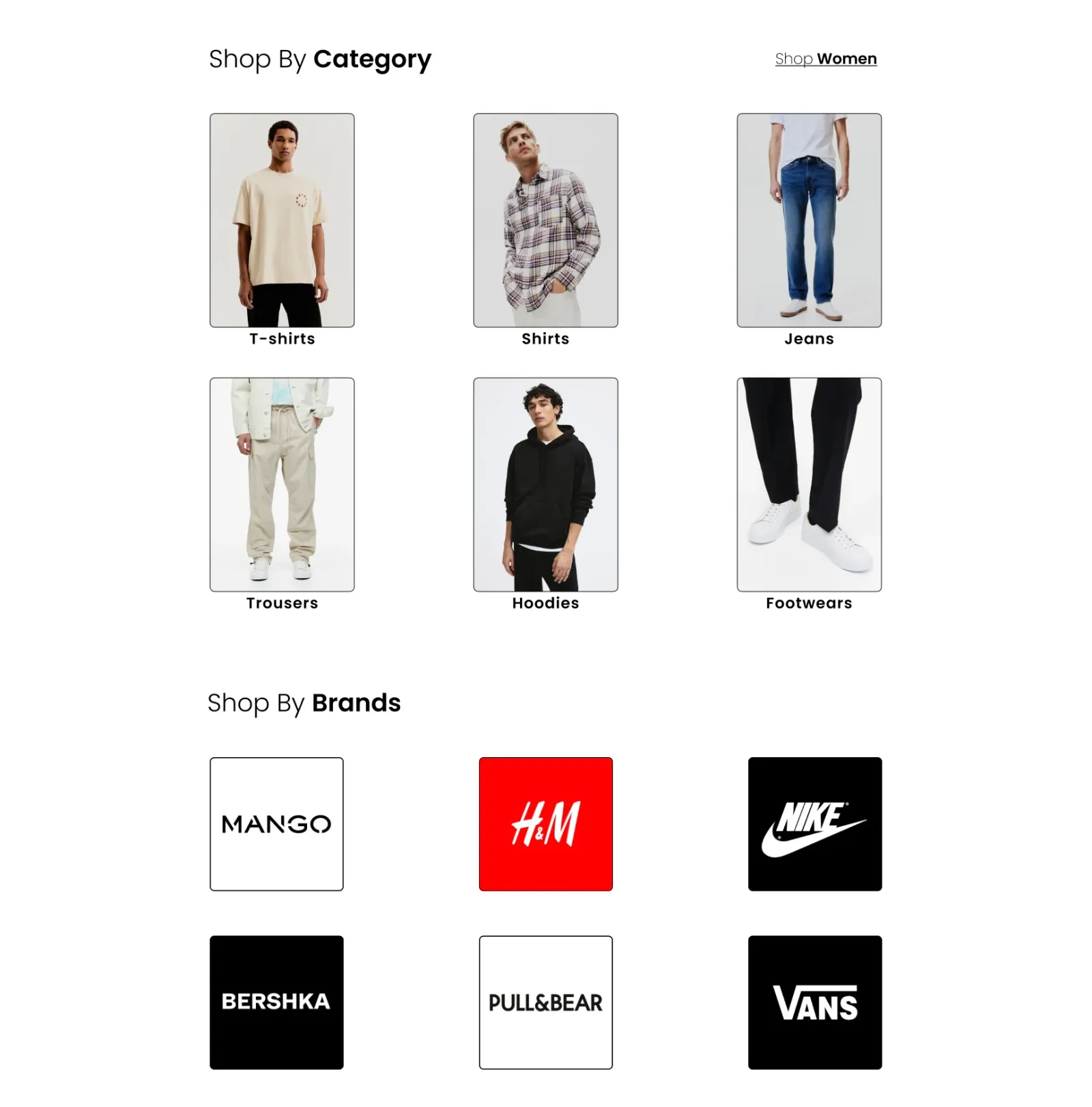
4 · Discovery that feels curated, not cluttered
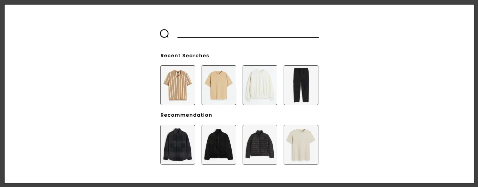
Thrift stock is unpredictable, so there are many ways in: category, brand, Bestsellers, Exclusive and “You may also like”. Browsers can wander; shoppers with a goal can filter by type, size, brand, price and condition.
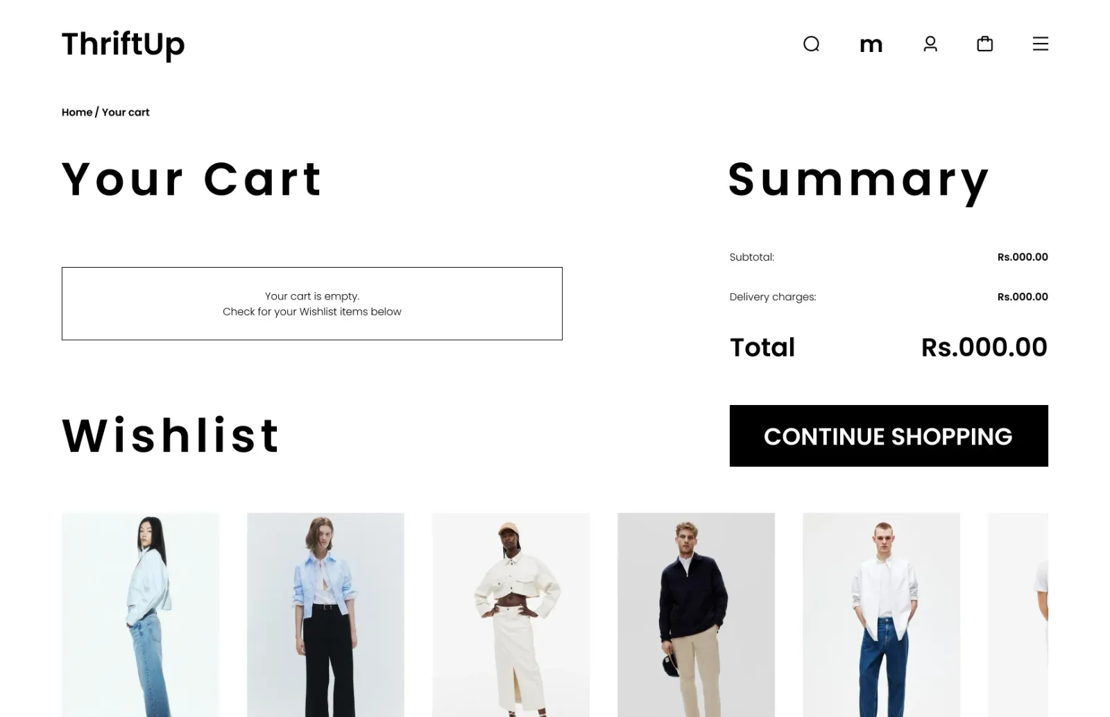
5 · No dead ends
07Visual system
Monochrome, so the clothes provide all the colour.
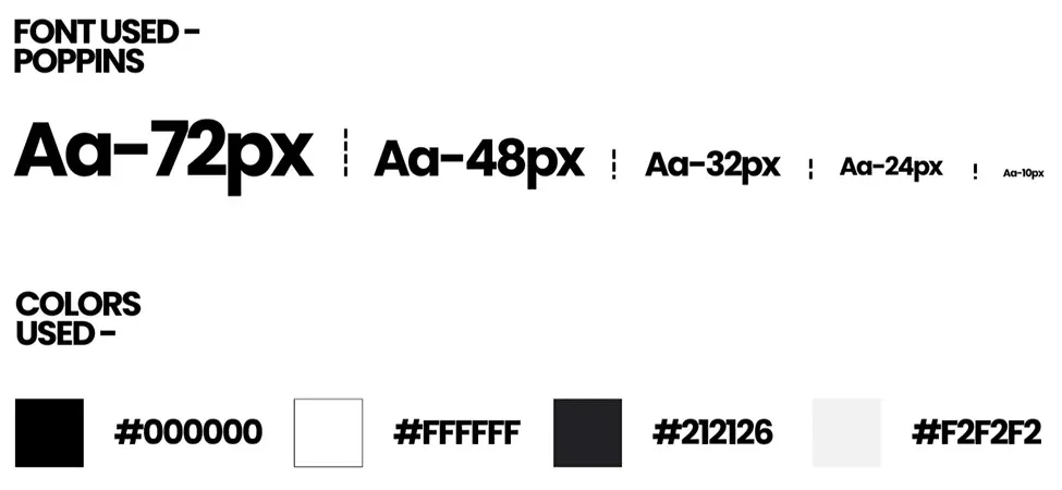
Second-hand catalogues are visually messy: every item is a different colour, shot in a different place. A strict black, white and grey interface stays out of the way, so a mixed catalogue still looks consistent and premium.
Poppins · 72 / 48 / 32 / 24 / 10 px · #000 · #FFF · #212126 · #F2F2F2
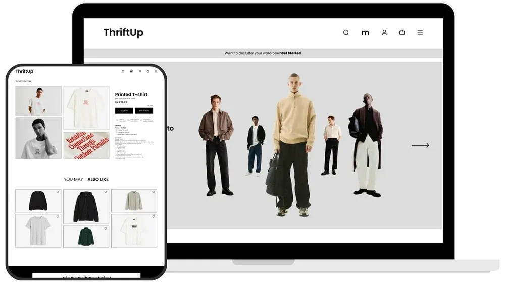
08Final design
Desktop and tablet.
09Reflection
If I took ThriftUp further.
Run usability sessions on the two key flows.
Buying an item, and listing one through ModaCash.
Estimate the payout before someone submits.
Not knowing the reward is the most likely reason a seller drops off.
Settle cash versus points.
The screens use both, so the reward model should be one clear promise.
Build the declutter flow around the phone camera.
Plus a clear condition grade (Like new / Gently used / Well loved) and an accessibility audit.
Next folder / W 005
What if…? →
Three tiny prototypes, one gesture each, tuned until they feel physical.